
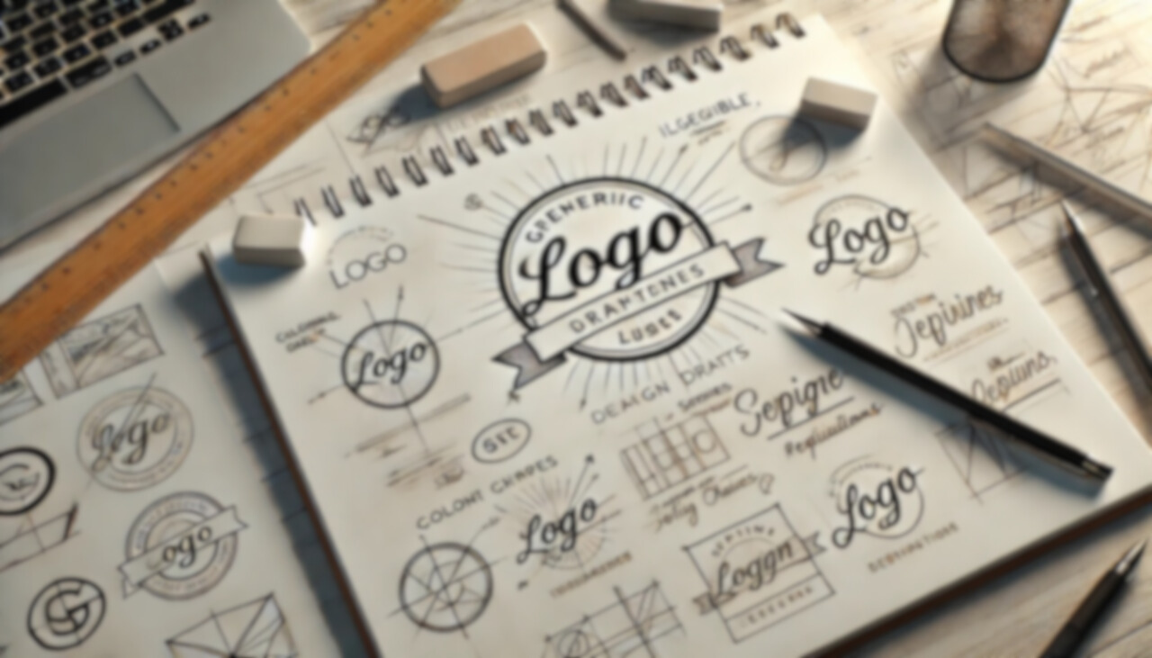
A logo is far more than a decorative symbol—it is the cornerstone of a professional brand’s identity. Whatever your field, a well-designed logo communicates trust, credibility, and expertise. It is the visual encapsulation of a firm’s values and professionalism, often forming the first impression that clients, patients, or colleagues receive. Consequently, a strategic approach to logo design is not merely advisable but imperative. Below, we will delve into the nuanced strategy behind effective logo design, its psychological and marketing principles, and how professionals can leverage it for long-term success.
The Foundations of Strategic Logo Design
1. Brand Identity and Positioning
Before jumping into colors, typography, or shapes, you must first define a brand identity. This requires answering key questions:
- What values does the organization stand for?
- What emotions should the logo evoke?
- How should the brand be positioned within its industry?
A law firm, for example, should project authority and stability, while a medical practice may need to emphasize compassion and care. Defining this identity ensures that the visual elements of the logo align with the intended brand message.
2. Simplicity and Memorability
The most successful logos adhere to a principle of simplicity. A complex logo may look visually appealing but can be difficult to reproduce, recognize, or remember. Consider the logos of prestigious institutions—Harvard’s shield, the American Bar Association’s emblem, or the American Medical Association’s symbol. These designs are straightforward yet powerful.
Simplicity ensures memorability. Research from the Journal of Consumer Research indicates that people recall simple designs with greater ease than intricate ones (Henderson & Cote, 1998). A logo should be distinct yet not overly elaborate, ensuring that it is recognizable at a glance.
3. Versatility Across Mediums
A professional’s logo must function across a variety of applications—business cards, websites, letterheads, and signage. Scalability is a key consideration; the logo should maintain its clarity whether it is printed on a pen or displayed on a billboard. Vector-based design ensures that the logo remains sharp and proportional in any format.
A well-designed logo also accounts for color variations. It should be effective in full color, grayscale, or monochrome. Legal and medical professionals often require their logos to be used in professional documentation, which may be printed in black and white—further reinforcing the need for a versatile design.
Psychological and Marketing Principles in Logo Design
1. The Psychology of Colors
Color plays a pivotal role in shaping perception. Studies in color psychology suggest that different hues evoke specific emotions (Kaya & Epps, 2004). Here’s how colors are often perceived in professional fields:
- Blue: Trust, professionalism, intelligence (widely used in law firms and medical practices)
- Green: Health, renewal, tranquility (ideal for wellness clinics or financial services)
- Black: Sophistication, authority, tradition (commonly used in high-end legal and corporate branding)
Choosing the right color ensures alignment between the logo and the desired brand perception. A legal professional seeking to instill confidence may favor deep navy or charcoal tones, while a physician specializing in holistic medicine might prefer earthy greens.
2. Typography as a Branding Element
Typography communicates just as much as color or imagery. Serif fonts, such as Times New Roman or Garamond, exude tradition and credibility—making them suitable for legal firms. Sans-serif fonts, such as Helvetica or Lato, convey modernity and approachability, which may be preferable for healthcare professionals.
A professional logo should not rely on trendy fonts that may become outdated quickly. Instead, timeless typefaces ensure longevity and readability across different media.
3. Symbolism and Shape Psychology
Shapes and symbols carry subconscious meanings. Circular logos often suggest unity and trust (e.g., medical institutions), whereas angular logos can communicate precision and strength (e.g., law firms and engineering firms). For instance:
- Circles: Inclusivity, continuity, protection
- Squares/Rectangles: Stability, reliability, structure
- Triangles: Innovation, progress, hierarchy
By incorporating these principles, a logo can reinforce the values a professional firm seeks to communicate.
Common Pitfalls in Logo Design for Professionals
1. Over-Reliance on Trends
Trends are ephemeral, but a professional brand is built for longevity. While contemporary design elements can enhance aesthetics, they should not overshadow the fundamental branding message. Avoid overly stylized fonts, excessive gradients, or complex imagery that may become obsolete in a few years.
2. Poor Font Choices
Legibility is non-negotiable. Script fonts, while elegant, can be difficult to read, particularly on digital platforms or when scaled down. A professional logo must maintain readability in all contexts—whether in an email signature or on a large conference banner.
3. Ignoring Brand Consistency
A logo should seamlessly integrate with all branding elements, including business cards, websites, and legal documents. If a law firm’s website is designed with a sleek, minimalistic approach, but its logo is overly intricate, there is a disconnect in branding. Consistency fosters trust and professionalism.
The Role of a Professional Logo in Client Perception
A well-designed logo does more than decorate—it influences client perception and decision-making. According to a study in the Journal of Marketing Research, first impressions are formed within 50 milliseconds of viewing a brand’s visual identity (Lindgaard et al., 2006). A professional logo immediately communicates authority, reliability, and competence, which are critical in high-stakes fields such as law and medicine.
Crafting a Timeless Logo: The Strategic Approach
The most effective logos stand the test of time. Consider brands like the American Medical Association or the Supreme Court of the United States—both have enduring emblems that are instantly recognizable. Here’s how to ensure longevity in logo design:
- Minimalism: Strip away unnecessary elements to retain clarity.
- Legibility: Choose typography that remains readable across all sizes and mediums.
- Balance: Harmonize color, font, and shape for a cohesive design.
- Uniqueness: Avoid generic symbols that dilute brand identity.
Conclusion: The Importance of a Thoughtful Logo
A strategic approach to logo design is essential for any professional seeking to establish credibility and recognition. By carefully considering color psychology, typography, and symbolism, professionals can create a logo that reinforces their expertise and reliability. A well-crafted logo is not merely an aesthetic choice—it is an investment in long-term brand equity.
Your logo is the face of your brand—make sure it speaks to your professionalism and expertise. Our branding specialists are here to help you craft a logo that embodies your firm’s values and sets you apart in your industry. Contact us today to begin designing a logo that represents your company.