
The Importance of Font Choice in Website and Graphic Design
In the realm of website and graphic design, font choice is more than just a matter of aesthetics; it plays a crucial role in readability, user experience, and brand identity. Fonts communicate emotions, establish hierarchy, and influence how users perceive content. Understanding both the design and psychological aspects of font selection is essential for creating effective digital experiences.
The Design Aspect of Fonts
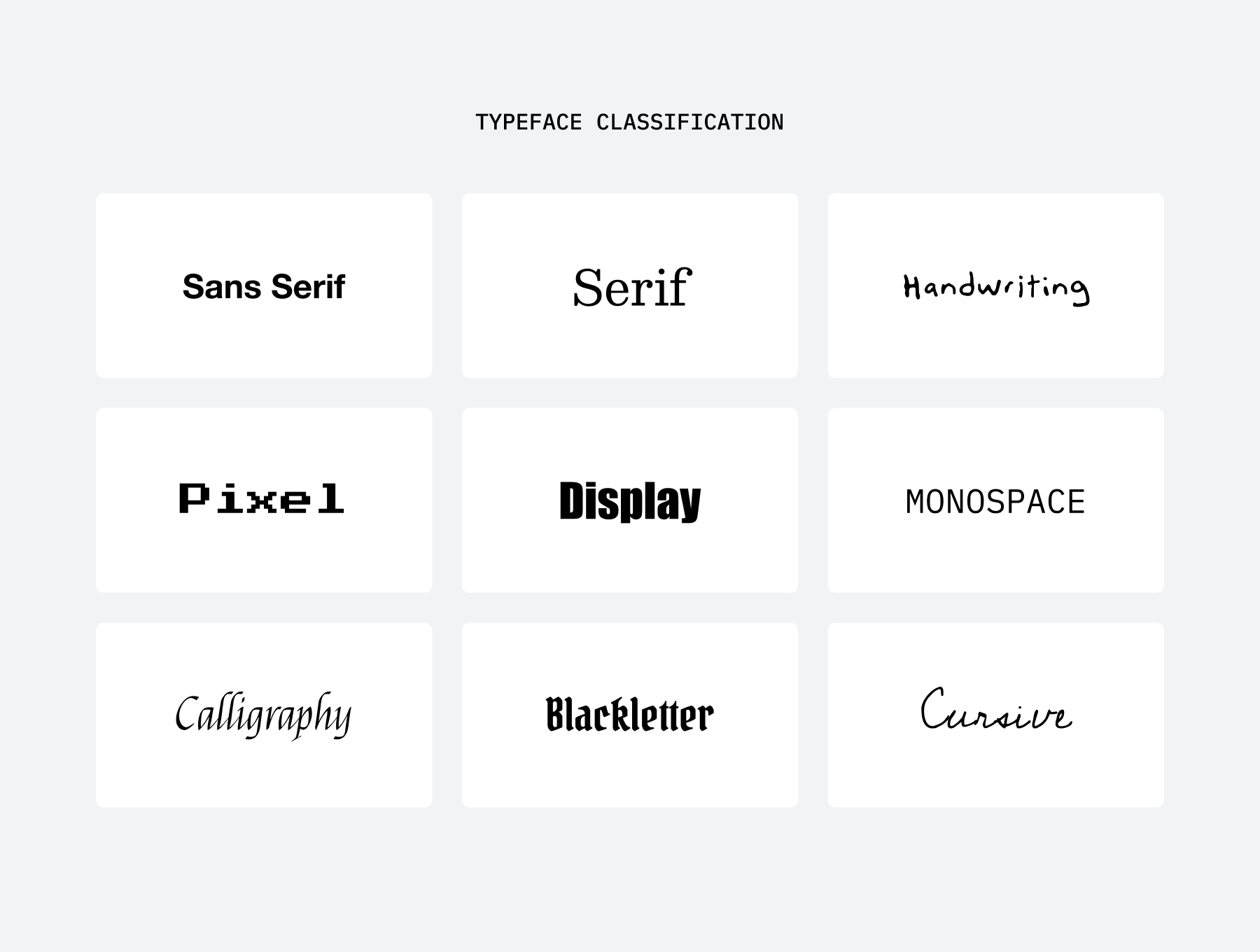
From a design perspective, fonts contribute significantly to the visual appeal of a website or graphic. Designers categorize fonts into several groups, each serving different purposes and evoking distinct reactions.
Serif Fonts: Tradition and Authority
Serif fonts, such as Times New Roman
Sans-Serif Fonts: Modern and Clean
Sans-serif fonts, like Helvetica, Arial, and Roboto, do not have the decorative strokes of serif fonts. Their clean and straightforward appearance makes them ideal for modern web design and digital interfaces. Because of their clarity on screens, sans-serif fonts dominate user interfaces, ensuring readability and accessibility across devices.
Script and Handwritten Fonts: Elegance and Personality
Script fonts, such as Lobster and Pacifico, mimic cursive handwriting, adding a touch of elegance or informality depending on the style. These fonts work well for invitations, branding materials, and luxury goods but should be used sparingly in body text due to potential readability issues.
Display Fonts: Bold and Attention-Grabbing
Display fonts, including styles like Impact, Bebas Neue, and Playfair Display, are designed for headlines and branding elements. These fonts capture attention quickly, making them suitable for logos and advertisements. However, their distinctiveness can make them overwhelming if overused in body text.
The Psychological Impact of Fonts
Beyond their visual function, fonts influence human psychology, affecting how users feel about content and brands. The right font choice can enhance user engagement, while the wrong selection can create confusion or disinterest.
Fonts and Brand Personality
Different fonts project distinct brand identities. For example, a company aiming for a high-end, luxurious image may opt for a sophisticated serif or script font. Conversely, a tech startup might use a clean, geometric sans-serif to communicate innovation and modernity.
Take Apple’s branding as an example: its consistent use of San Francisco, a sans-serif font, reinforces its sleek, minimalistic identity. Similarly, brands like Tiffany & Co. use serif fonts to highlight elegance and heritage.
Readability and User Engagement
Studies show that font readability impacts how long users stay on a website. Fonts with too much ornamentation or poor kerning (spacing between letters) can cause eye strain, leading to frustration and higher bounce rates.
For instance, websites focusing on long-form content, such as blogs and news sites, benefit from using Georgia or Merriweather, serif fonts optimized for on-screen reading. On the other hand, e-commerce websites prefer sans-serif fonts like Montserrat or Lato for their clarity and ease of scanning product descriptions.
Emotional Responses to Fonts
Typography also evokes specific emotions. Bold, heavy fonts can signify strength and reliability, while light, airy fonts convey openness and friendliness. Comic Sans, for example, is often criticized for being overly casual and unprofessional, yet it is frequently used in children’s materials due to its approachable feel.
Best Practices for Font Selection
To ensure an effective design, consider the following best practices when selecting fonts:
- Match Fonts to Brand Identity – A financial institution should use professional, authoritative fonts, whereas a creative agency might experiment with more artistic typefaces.
- Prioritize Readability – Avoid overly decorative fonts for body text and maintain sufficient contrast between text and background.
- Use Font Pairing Wisely – Combine complementary fonts, such as a serif for headings and a sans-serif for body text, to create visual balance.
- Consider Accessibility – Ensure fonts are legible across different screen sizes and for users with visual impairments by using accessible typefaces and appropriate sizing.
Conclusion
Font choice is a fundamental aspect of website and graphic design, influencing aesthetics, readability, and psychological impact. Whether aiming for tradition, modernity, elegance, or boldness, designers must consider both design principles and human psychology when selecting fonts. By making informed choices, brands can strengthen their identity, improve user experience, and leave a lasting impression on their audience.
If you feel like this was an overwhelming amount of choices for just what sort of text you use for your graphics, we’ve got you covered. With years of experience managing websites, crafting graphics, and everything in between, we can help you figure out so much more for your next project. Let us know if you’d like help with graphic design or branding and we’ll be sure to help you make your most optimal font choices.